
Facebook Messenger
UX Case Study - This project re-imagines messenger mobile app based on user needs.
My Role
Team
Timeline
Tools
Problem Statement
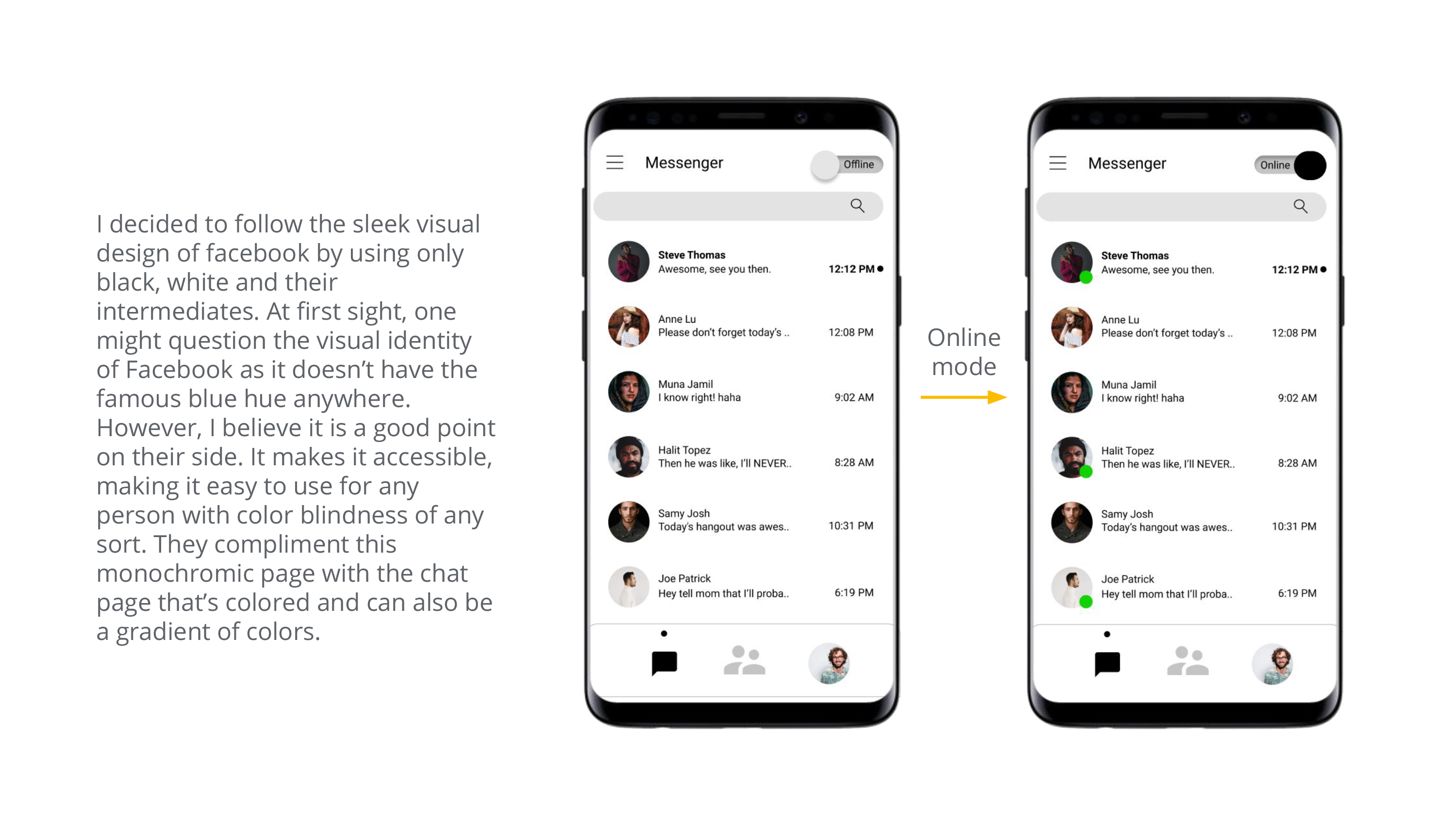
There are abundant Facebook messenger users worldwide. Not all users are satisfied with how messenger looks like.
Goal
Enhance the application to make it more accessible and easy to use.
Research
- Quantitative Survey
- Qualitative open ended questions
- User Interview
I have conducted a survey using Google Forms to reach a wider range of audience in limited time, and also interviewed 2 individuals from my friends and family for a more elaborate understanding of the user needs. It must be noted that interviewing only 2 individuals would limit the scope of the research, but for the purposes of this case study duration, I have decided to keep it at 2. I focused on the following features: Upload, voice/video calls, stories and status view (online/offline mode).
Questions
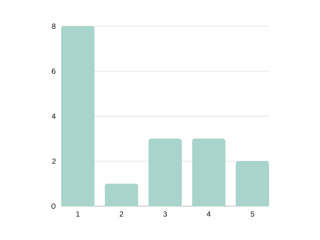
From scale 1 to 5, 1 being lowest and 5 being highest, how satisfied are you with the upload feature in facebook messenger (images, videos)?
From scale 1 to 5, 1 being lowest and 5 being highest, how satisfied are you with the ability to appear online/offline and to see others online/offline?
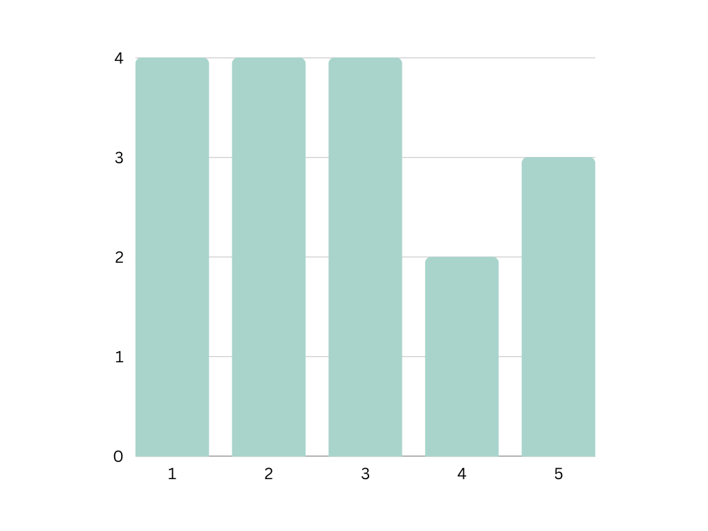
From scale 1 to 5, 1 being lowest and 5 being highest, how satisfied are you with the stories feature?
Reasoning
I specifically focused on 4 different features, 2-3 questions for each, with minimal question answering. This is due to the fact that people do not usually like answering such surveys. It was a good quick quantitative metric, but it did not give a deeper understanding of the problem. The interview and my own experience both gave me the depth I was looking for.
Pain Points

control the ability to
appear online or offline when they want to.
stories, and that “we
have instagram for that”.
Persona
Noura

"I love art. I am using my skills to start my career early even though I am still a student."
Goals
- I want to combine all my work in one application without needing multiple applications to contact clients through.
- I need to have personal times when I appear unavailable to my clients.
Frustrations
- I can't send high quality images or files.
- Sometimes I forget how to turn off the active status and have to look it up.
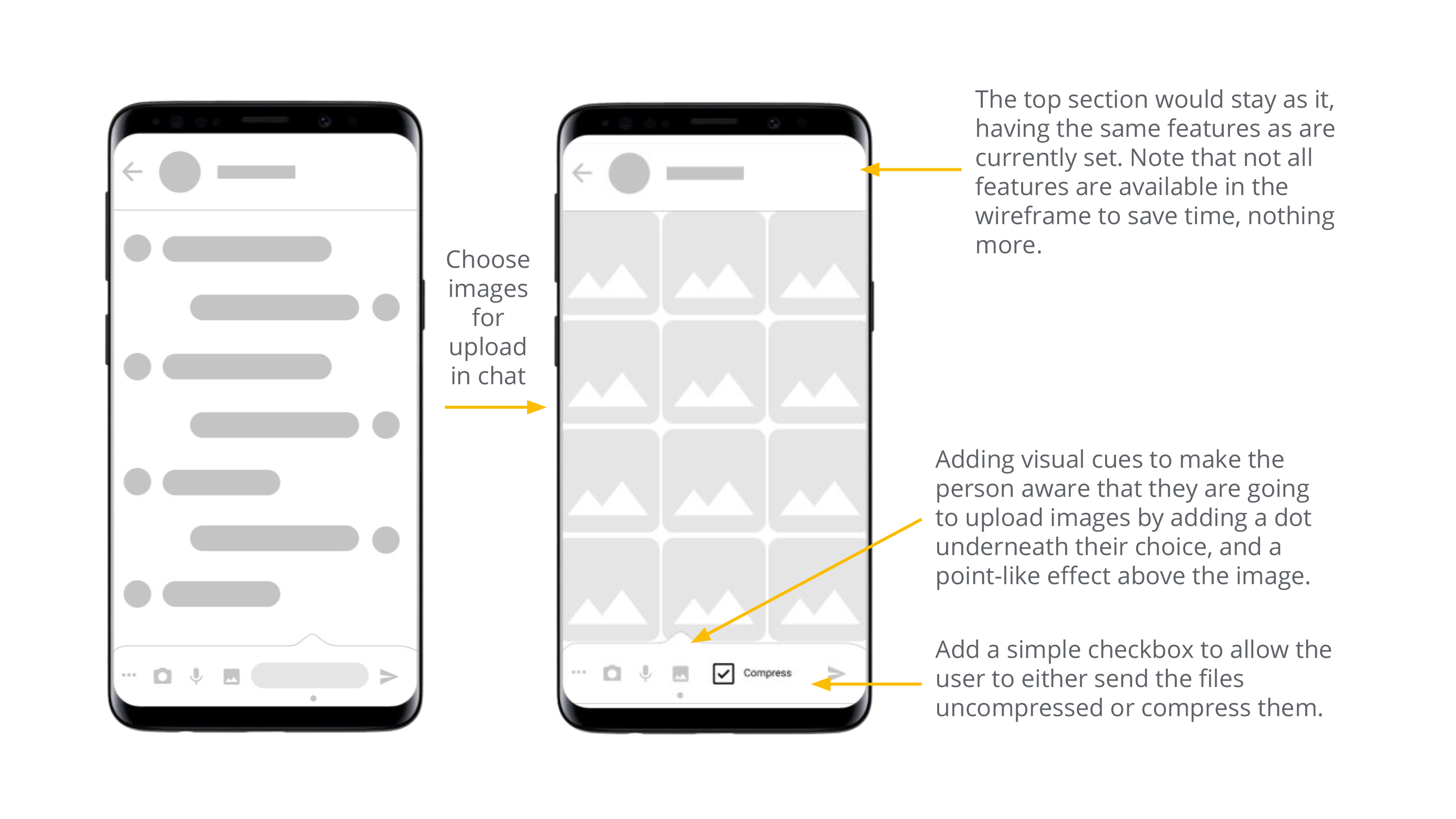
Wifreframes

Prototype
The prototype was created using Figma. Click on the image below if you would like to explore the prototype.
Usability Study
This was limited to 2 participants who tried this prototype and gave us their insights from using it. Note, however, that they were told that some buttons are not clickable and that it is not a feature.
Findings
